Playtest Report 3 Art
Sunrise in Slumberland » Devlog
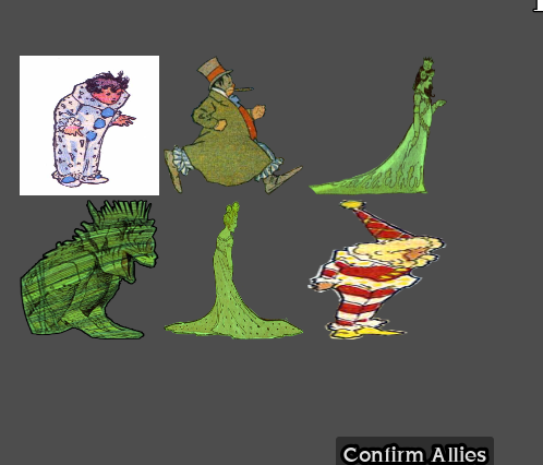

scroll through the visaul aid above
Playtest report 3
testing art and getting feedback for current build as a whole. All playtesters represent our target audience.
| digital prototype |
|---|
| Player doesn't know charcters names or any information |
| Players are not strategizing due to information not being made clear |
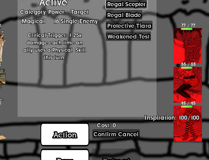
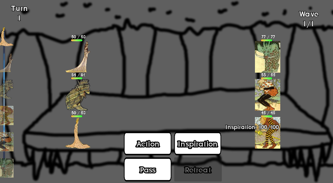
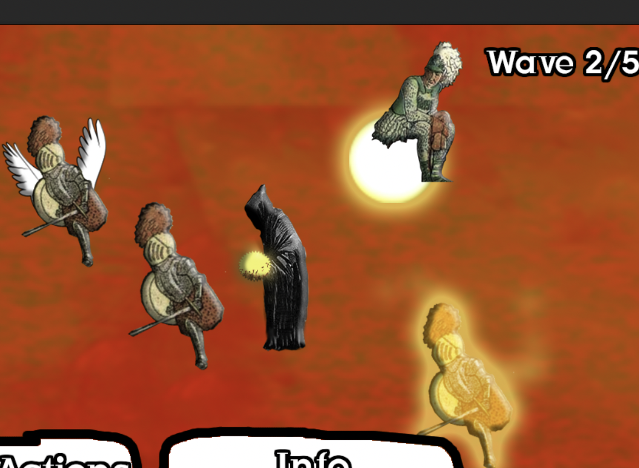
| Players don't know how to use inspiration and stay stuck on confirm/cancel for the whole battle |
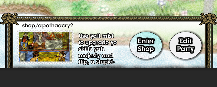
| Assets don't blend well looks like placeholder art |
| Player received game as mythical |
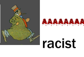
| Player perceived flip as a problematic minstrel from the early 20th century |
| Wip art playtest |
|---|
| Area 1 map art blends well couldn't tell it was a collage |
| All area themes generally are coherent and color matching area 2 is a more noticeable collage |
| Players don't know how to use inspiration and stay stuck on confirm/cancel for the whole battle |
| Assets don't blend well looks like placeholder art |
| Player received game as mythical |
| World map gives player a "Mario" vibe |
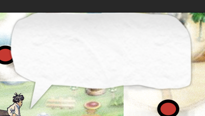
| dialog box paper texture is cool but not the shape needs to look more like comic. |
| emboss effect on player adds little detail |
| inconsistent button styling needs unique outline |
| map chapters need stronger outline |
| need to be less text on the world map screen |
| justoldfashioned is overused |
| gradients for skills is lazy |
| mirror menu looks squashed and not fitting |
Get Sunrise in Slumberland
Sunrise in Slumberland
Combo-centric turn-based RPG
| Status | Prototype |
| Authors | David Turner The Artist, NightFreeze, Fabiantheguy |
| Genre | Role Playing, Adventure |
| Tags | 2D, Fantasy, No AI, Pixel Art, Singleplayer |
More posts
- Code Week 5 Goals11 days ago
- Design - Week 5 and Playtest Report11 days ago
- Art Week 418 days ago
- Code Week 418 days ago
- Playtest report 2 Art18 days ago
- Playtest Report 1 Art18 days ago
- Playtest Report - 10/2818 days ago
- Design - Week 418 days ago
- Code Week 320 days ago
Leave a comment
Log in with itch.io to leave a comment.